 klaus-michael schneider
Keywords: los rios | quevedo |
Links: FOTW homepage | search | disclaimer and copyright | write us | mirrors

FOTW beschäftigt sich mit der Wissenschaft der Vexillologie (Flaggenkunde).
Alle auf dieser Website dargebotenen Abbildungen dienen ausschließlich der Informationsvermittlung im Sinne der Flaggenkunde.
Wir distanziert uns ausdrücklich von allen hierauf dargestellten Symbolen verfassungsfeindlicher Organisationen.
Last modified: 2021-08-26 by  klaus-michael schneider
Keywords: los rios | quevedo |
Links: FOTW homepage |
search |
disclaimer and copyright |
write us |
mirrors
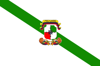 image by Ivan Sache, 29 December 2020
See also:
The municipality of Quevedo (173,585 inhabitants in 2010, therefore the 10th
most populated town in the country) is the capital of Los Rios province.
Quevedo is named for the land surveyor Timoteo Quevedo, who surveyed the area on
behalf of its owner, Catalina Estupińán; the small settlement established there
in 1857 to exploit rubber was soon known as Las Tierras de Quevedo.
Quevedo
was elevated a rural parish of Pujilí canton on 22 September 1852, to be
transferred in 1885 to Latacunga canton. After the establishment of Los Rios
province on 6 October 1860, Quevedo was transferred to Vinces canton, to be
reincorporated to Pujilí in 1861, and eventually, on 4 February 1869, to Vinces.
Quevedo canton was established on 7 October 1943.
http://quevedo.gob.ec/
Municipal
website
Ivan Sache, 29 December 2020
The flag of Quevedo is white with a green stripe running from the upper hoist
to the lower fly, superimposed by the municipal coat of arms.
Photos
http://quevedo.gob.ec/concejales/
https://www.lahora.com.ec/losrios/noticia/1102290072/se-forma-nuevo-convenio-para-reforestar-quevedo
https://www.elcomercio.com/actualidad/quevedo-sicariato-circulacion-motocicletas-hombres.html
https://mirevistaec.com/el-municipio-de-quevedo-recibe-a-miss-ecuador/
https://www.aldia.com.ec/personal-de-salud-de-quevedo-recibe-reconocimiento-por-su-labor-destacada-frente-al-covid-19/
White represents the canton's youth and spiritual purity.
Green
represents agricultural resources.
Ivan Sache, 29 December 2020
r-qv.gif) image from
www.quevedo.gov.ec
image from
www.quevedo.gov.ec
The coat of arms is surmounted by a scroll in the national colors, inscribed
"Por la patria y por Quevedo" (For the Motherland and Quevedo) in the yellow
stripe.
The shield is quartered white-green-red-white.
Red symbolizes the
heroes' value and blood. White represents any kind of resource.
The quarters
are united by a wind-rose, emphasizing the significance of Quevedo for road
communications.
Beneath the shield, two cornucopias face each other.
https://web.archive.org/web/20080826014701/http://www.quevedo.gov.ec/cc/Site/Fijos/Simbolos.aspx
Former municipal website (archived)
Quevedo is divided into 11 parishes: 7 de Octubre, 24 de Mayo, El Guayacán,
Nicolás Infante Díaz, San Camilo, San Cristóbal, Quevedo, Venus del Río Quevedo,
Viva Alfaro, San Carlos, La Esperanza.
The design of the parish flags was
initiated in 2010 by a call of the Mayor of Quevedo to the Parish Councils. On
15 June 2010, Soraya de Quijano, Director of the Municipal Department of
Culture, gathered the Presidents of the Parish Councils; it was recommended to
involve the schools of each parish in the design of the flag, which would
preferentially use the white, yellow and green colors.
Description and
images from:
http://quevedo.gob.ec/banderas-de-parroquias-de-quevedo/
Municipal
website
Ivan Sache, 29 December 2020
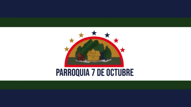 image by Ivan Sache, 29 December 2020
The flag of 7 de Octubre was designed by the Parish Council led by Ike Macías
Álava, using the three colors of the national flag (yellow, blue and red) and
the two colors of the canton flag (white and green).
The flag is white
with two blue and green diagonal stripes [horizontal on the image] at the top
and bottom.
In the center is featured, inscribed in a semi-circle, the logo
of Instituto Tecnológico Superior 7 de Octubre and the beautiful wood that
surrounds it. The semi-circle is framed by seven stars, in the national colors,
representing the parish name.
The parish name is written in blue letters
beneath the emblem.
Ivan Sache, 29 December 2020
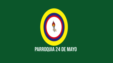 image by Ivan Sache, 29 December 2020
24 de Mayo was established on 19 August 1987. The parish is named for the 24
de Mayo school, founded in 1950 by the municipality in the place called La Loma,
the origin of the modern town of Quevedo.
The flag of 24 de Mayo was
designed on 18 June 2010 in a meeting held at Colegio Técnico Nacional 24 de
Mayo. Nicolás Enríquez Yumbla, President of the Dios Avilés Zarate sector and
teacher at the school, conveyed the leaders of the 20 sectors of the parish, but
only a representative of Los Ángeles showed up.
The flag is green with an
oval emblem and the parish name, written beneath it.
The green and white
colors represent the town of Quevedo.
Yellow, blue and red are the national
colors.
The torch represents the triumph of the heroes in the battle of
Pichincha.
The 20 stars originally intended to represent the parish's sectors
were removed from the final version, since new sectors may be established in the
future.
The battle of Pichincha, won on 24 May 1822 by the patriot army
commanded by General Sucre, was the final step to the liberation of Quito and
the provinces under the Quito colonial administration.
The battle was fought
on the slopes of the Pichincha volcano, close to the town of Quito.
Ivan Sache, 29 December 2020
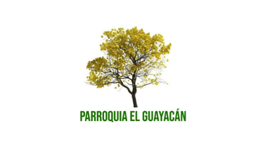 image by Ivan Sache, 29 December 2020
The flag, designed by Flora Elva Monserrate Castro, was democratically
approved on 29 June 2010 by a Parish Committee.
The flag is white,
representing the purity of peace and union of the inhabitants, charged in the
center with a guayacán tree alluding to the name of the parish, which is written
in green letters beneath the emblem.
Guayacán (Guiacum santum
L., holywood) is a tree native to tropical America, which was subsequently
planted elsewhere (for instance, in Ecuador).
Ivan Sache, 29 December 2020
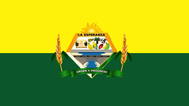 image by Ivan Sache, 29 December 2020
The flag was unveiled on 6 August 2010, based on proposals submitted by
different schools of the parish.
The flag is horizontally divided
yellow-green with an emblem in the center. The companion text, however,
describes it as horizontally divided yellow-white-green with a star in each
stripe, which seems to be the flag in actual use.
Photo
http://quevedo.gob.ec/gad-parroquial-la-esperanza-organizo-hora-civica-en-homenaje-a-la-gesta-heroica-del-24-de-mayo/
The shield is surmounted by a rising sun. In the upper left quarter, an
open book represents the source of knowledge, hold by two hands representing the
solidarity values of an united people. The upper right quarter features the
abundant fauna and flora, as well as resources in agriculture and
cattle-breeding.
The lower quarter features the majestic and sinuous river
San Pablo.
The shield is supported by two wheat spikes. Beneath the shield, a
scroll is inscribed with the motto "Orden y Progreso" (Order and Progress).
Ivan Sache, 29 December 2020
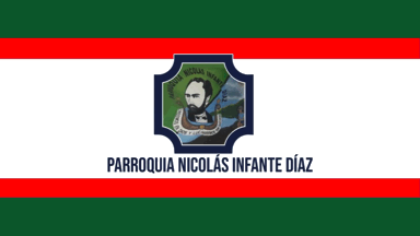 image by Ivan Sache, 29 December 2020
The flag was approved on 30 June 2010. Manuel Piuri presented four proposals,
while Cinthya Álvarez, the parish Beauty Queen, presented one proposal, which
was retained with a modified coat of arms.
The flag is horizontally
divided dark green-red-white-red-dark green (2:1:6:1:2) with the coat of arms in
the center, beneath it the parish name written in black.
The green
stripes represent vegetation, on top, the teks separating the parish from the
camp of Group of Terrestrial Forces No. 26, on bottom, the trees lining the
banks of the river.
The red stripes represent the past struggle of the
inhabitants to obtain a territory and their modern struggle for the increase and
progress of the parish.
The white stripe represents the harmonious and
pacific spirit of the inhabitants.
The coat of arms portrays the parish
namesake, Colonel Nicolás Infante Díaz. Beneath the bust, a wooden arch
symbolizes the resources in tek. The Spanish motto, "We Believe in God and
Struggle for Quevedo", emphasizes the faith and progress of people working hard
for the growth of Quevedo, Los Ríos and Ecuador. The other side of the shield
features the Playa Grande (Big Beach) river spa, a natural pride and privilege.
Colonel Nicolás Infante Díaz (1847-1885) was appointed by General Eloy
Alfaro Supreme Chief of the Radical Liberal Party in Guayaquil, following a coup
set up in 1876. Leading the Chapulos Hussar battalion, he fought in different
revolutionary episodes and was eventually captured and shot.
Ivan Sache, 29 December 2020
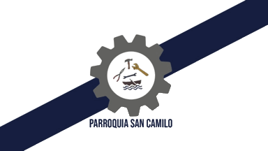 image by Ivan Sache, 29 December 2020
The flag was adopted, among different proposals, in a meeting held on 2
November 2010 at the Parish Council.
The flag is white with a blue
diagonal stripe running from the lower hoist to the upper fly. In the center is
placed a gray cogwheel inscribing industrial tools and a boat placed on a white
background.
White represents the purity of the inhabitants.
Blue
represents the sky.
The cogwheel and tools represent mechanic industry, while
the boat represents the river.
Ivan Sache, 29 December 2020
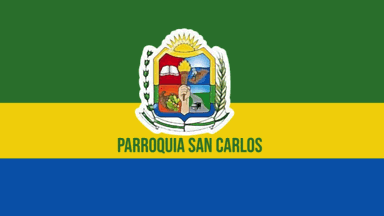 image by Ivan Sache, 29 December 2020
The flag was adopted on 30 June 2010 in a meeting held at the Parish Council.
Javier Jiménez, director of Escuela Estenio Burgos Galarza, presented a proposal
using the green, yellow and blue color, representing agriculture, wealth and
water and fish resources, respectively. Jorge Guzmán, from the Municipal
Library, presented a proposal using the same color but white, representing
peace, liberty and respect, instead of blue. The design with the blue color was
adopted by 7 to 3.
The flag is horizontally divided green-yellow-blue
(2:1:1) with a coat of arms in the center, beneath it, the name of the parish in
green letters.
Ivan Sache, 29 December 2020
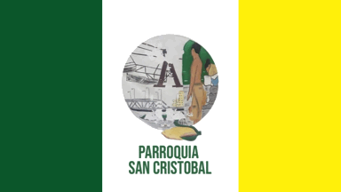 image by Ivan Sache, 29 December 2020
The flag was unanimously approved in a meeting held on 30 July 2010 at the
Parish Council.
The flag is vertically divided green-white-yellow with an
emblem in the center, beneath it the parish name in green letters.
The emblem
features the "tarabita" (local cable-way), a woman doing the washing in the
river and a man disembarking products transported via the river (bananas, yucca,
coffee). The Velasco Ibarra bridge is featured in the background.
The
Velasco Ibarra bridge, inaugurated on 30 November 1955, was built by the Jones
Americana company, on the model of a similar bridge built in Pichincha (Manabi).
The local, urban legend, says that the bridge was built to replace an old wooden
toll bridge operated by Camilo Arévalo. When the presidential convoy was asked
to pay the toll ("Everyone should pay, the President included), the infuriated
José María Velasco turned back and initiated the design of a new bridge.
José
María Velasco (1893-1979) became President of Ecuador five times (1934-1935,
1944-1947, 1952-1956, 1960-1961, 1968-1972).
https://lahora.com.ec/losrios/noticia/1102329631/historia-65-anos-del-puente-velasco-ibarra
La Hora, 7 October 2020
Ivan Sache, 29 December 2020
 image by Ivan Sache, 29 December 2020
The flag was selected in a meeting held on 7 July 2010 in Escuela Dr. Carlos
Finlay. The flag was adopted by acclamation. The alternative design was similar
but with a greeting hand in the center and the motto "La Unión fortalece a la
Comunida" (Union Strengthens the Community).
The flag is quartered
green-celestial blue-ultramarine blue-yellow by a white cross. In the center is
placed a Venus figure surmounted by the motto "Con Unión y Cultura Progresamos"
[We Progress Through Union and Culture] in a semi-circular pattern. The parish
name is written beneath the figure.
White symbolizes the spiritual purity
of the inhabitants.
The upper left, green rectangle represents the immense
agricultural resources.
The upper right, celestial blue rectangle represents
aspiration to progress by the community.
The lower left, ultramarine blue
rectangle represents the rivers and straits crossing the parish.
The lower
right, yellow rectangle represents the sun.
The Venus figure, from the
Valdivia Milagro-Quevedo culture, represents maternity and puberty. The culture
was based on irrigated agriculture practiced on the best soils, therefore the
inhabitants committed to work and progress identify themselves with the Valdivia
culture.
Anthropomorphic figures characteristic of the Valdivia culture
are believed by Carlos Zevallos and Olaf Holm to have been worshiped in
fertility cults.
http://culturaunemi.blogspot.com/search/label/Venus%20de%20Valdivia
UNEMI
Ivan Sache, 29 December 2020
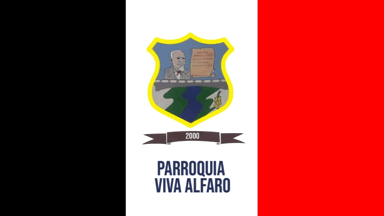 image by Ivan Sache, 29 December 2020
The flag was designed by Margot Aguirre, Ricardo Aguirre and José Rubén
Aguirre Pérez, with the economic support of a group of inhabitants of the
parish.
The flag is vertically divided black-white-red with a coat of
arms in the center, beneath it a black scroll inscribed in white with "2000",
the year of foundation of the parish, and the parish name in dark blue letters.
The coat of arms portrays the parish namesake, Eloy Alfaro (1842-1912),
leader of the Liberal Revolution (1895-1912), President of Ecuador from 1895 to
1901 and 1906 to 1911.
Ivan Sache, 29 December 2020
Hosted by: Fanshop-Online.de und Handy-Shop.de
Tipp: Apple iPhone 12 im Shop