FOTW beschäftigt sich mit der Wissenschaft der Vexillologie (Flaggenkunde).
Alle auf dieser Website dargebotenen Abbildungen dienen ausschließlich der Informationsvermittlung im Sinne der Flaggenkunde.
Wir distanziert uns ausdrücklich von allen hierauf dargestellten Symbolen verfassungsfeindlicher Organisationen.
Last modified: 2015-01-11 by klaus-michael schneider
Keywords: mail(portugal) | ctt-correios | rider | horn |
Links: FOTW homepage |
search |
disclaimer and copyright |
write us |
mirrors

"CTT" stands traditionally for "Correios, Telégrafos e Telefones"
(Mail, Telegraph and Telephone) and it is the name of Portugal's state-owned
postal service, under almost constant (though discrete) rebranding and
redefining in the last 25 years. It gained and then lost, from and for other
companies, several services through the years. Currently (since about 1995)
it operates the postal service (telegraphy was long ago replaced by fax
and then e-mail: it is not a technology in use and the equivalent services
recently dropped the term), and has a very large network of offices and
filials, which offer also other communication, security and validation
services. The current name is "CTT- Correios".
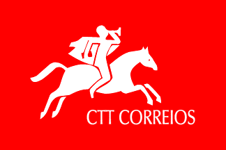
The flag of CTT is red with its logo and lettering in white on it. It is
not an often sight, the large office network notwithstanding. I saw it no
more than once, waved by a staged cheering crowd of youngsters in a self
promotional videoclip shown on screen in a post office.
The logo itself has been essentially the same since at least 1953: a
horseman blowing a bugle; this has had design changes in 1964, 1993 and
2004. A lettering without logo is mentioned as proposed (but not adopted)
dated somewhen between 1953 and 1964. Prior to 1953, there were emblem
adoptions in 1936 (the usual armillary sphere and Portugal Ancient
escutcheon arrengement, with a thunderbolt) and 1894 (crowned winged
envelope for Mail and crowned winged thunderbolts for Telegraph).
António Martins-Tuválkin, 27 Jan 2007

Since the 2004 design did affect only the image of the horseman and the
lettering (and not, f.i., the distinctive use of red), there may have been
a red flag with the 1993 logo.
António Martins-Tuválkin, 27 Jan 2007

A flag was internally adopted in 1983, but the source does not illustrate
it; it must have used the 1964-1993 logo. I attach a reconstruction.
António Martins-Tuválkin, 27 Jan 2007
back to Portugal Company Flags click here
Hosted by: Fanshop-Online.de und Handy-Shop.de
Tipp: Apple iPhone 12 im Shop