
FOTW beschäftigt sich mit der Wissenschaft der Vexillologie (Flaggenkunde).
Alle auf dieser Website dargebotenen Abbildungen dienen ausschließlich der Informationsvermittlung im Sinne der Flaggenkunde.
Wir distanziert uns ausdrücklich von allen hierauf dargestellten Symbolen verfassungsfeindlicher Organisationen.
Last modified: 2014-06-29 by klaus-michael schneider
Keywords: sporting clube de portugal | scp | lion (white) | lion (yellow) | cartouche | stripes (green and white) |
Links: FOTW homepage |
search |
disclaimer and copyright |
write us |
mirrors
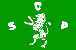
Sporting Club de Portugal (yes indeed the bit "Sporting Club" is
in English, the late 19th cent. lingua franca of soccer), one the
most important soccer clubs of Lisbon and of Portugal. (Oh, it’s not only a
soccer club, it has teams in other sports too — it’s athletics and roller
skate hockey are world famous too. But soccer gets, as usual, the lion’s
share.)
António Martins, 28 Jan 2001
The flag displayed by the side of the national flag at the main
entrance of the José Alvalade stadium in Lisbon (and nowhere to be
seen among the many supporter flags) is plain green
with a large white rampant lion centered on it and the letters
"SCP" scattered across the cloth: "S" vertically centered
near the hoist, "C" above the lion’s head, and "P" vertically centered
near the fly.
This design, though clearly inspired by the old logo
(or at least sharing a common origin), is different enough from it to
not be at stake after the adoption of the new logo.
António Martins, 30 Mar 2002
I’d really like to know about the reverse of the flag: does the lion
keep facing the hoist or not? And are the letters correct for reading
or not?
António Martins, 28 Jan 2001
As usual, there’s a lot of unofficial flags
around, particularly in all sorts of combinations of white, green and black,
the colours of the club’s jerseys.
António Martins and Jorge Candeias, 28 Jan 2001
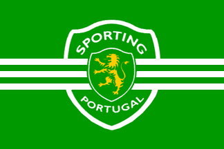
New logo on green with a wide white border; the white
horizontal fesses stretch out to the edges of the flag. IIRC the letters
"SCP" do not show. A rare design, powerful yet sober.
(This is a mass production design, sold by the thousand —
it ought to be seen a lot.)
António Martins, 30 Mar 2002
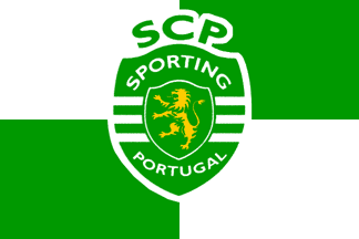
New logo with a wide white border on white and
green quertered. Not a bad idea, thogh it looks a lot like a
municipal flag.
(This is a mass production design, sold by the thousand —
it ought to be seen a lot.)
António Martins, 30 Mar 2002
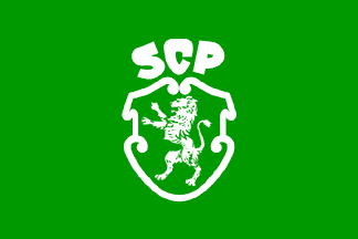
The green flag with the old logo is not (and apparently never
was) the club’s official flag.
António Martins, 30 Mar 2002
A 2:3 green field with the logo of the club
centered on it, the only changes being the color of the letters, white
instead of green, and the absence of the outline — for obvious
reasons, since the background on the flag is green.
António Martins, 28 Jan 2001
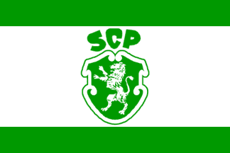
This variation, with the old logo on a green and
white “spanish” triband, was “legitimized”
by the cover illustration of a book, Sporting Club de Portugal
(by Rui Guedes publ. Dom Quixote: Lisboa, 1988), published with support
from the club.
António Martins, 31 Mar 2004
.gif)
Sporting got recently a new logo,
quite unfit to sit on a green background without
changes.
António Martins, 21 Oct 2001
A wide white border is used all around the emblem when this is set on a
plain green background (not only on flags).
António Martins, 30 Mar 2002
o.gif)
The logo is a green cartouche bordered in white and outlined in
green chaged with a white lion batalant facing dexter. Above the cartouche
(as a crest?), the lettering "SCP" set in a fantasy,
top heavy font. It appears on many unofficial flags.
António Martins, 28 Jan 2001
I believe the cartouche should be bordered in yellow, not in white.
And the same for the lion. The letters are white.
Jorge Candeias, 28 Jan 2001
Anything below this line was not added by the editor of this page.
Hosted by: Handy-Shop.de und Fanshop-Online.de
Tip: Animated GIF Flags / Fahnen / Flaggen