FOTW beschäftigt sich mit der Wissenschaft der Vexillologie (Flaggenkunde).
Alle auf dieser Website dargebotenen Abbildungen dienen ausschließlich der Informationsvermittlung im Sinne der Flaggenkunde.
Wir distanziert uns ausdrücklich von allen hierauf dargestellten Symbolen verfassungsfeindlicher Organisationen.
Last modified: 2015-06-13 by randy young
Keywords: pflag | p | stripes: 6 |
Links: FOTW homepage |
search |
disclaimer and copyright |
write us |
mirrors
P-FLAG is a volunteer non-profit organisation with
a membership of parents and friends who have been drawn
together because someone they know or love is gay or
lesbian.
Jarig Bakker, 21 May 1999, quoting from
PFlag Site
"P-Flag" is an acronym for Parents and Friends of
Lesbians and Gays.
Ole Andersen, 18 Jul 2002
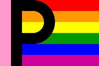
Do we know that this really is a flag or is it a representation,
i.e. symbol or logo,
utilizing a Gay flag, the emblem P superimposed, as
an identity. Conceptually, P-flag — gay flag with a P. I would be interested
to hear if this actually is used as a flag. In looking over the affiliated
sites of P-FLAG, including their central HQ site, the Perth one is the only
one so far (emphasis on the words so far) that displays this image.
Phil Nelson, 04 Jun 1999
I made a very fast visit to that site to download the picture and see if
there was something else of interest there, and I left with the impression
that it was a Perth-only thing (the original picture has the writing "Perth
Inc." in very small font under the flag).
Jorge Candeias, 01 Jun 1999

Well, it’s the umptieth variation of the
gay rainbow flag, this time with
a thin pink stripe by the hoist followed by a large black "P", extending
from top to bottom. I sure would like to see it flying; common sense says
that the reverse shows a reversed "P", almost like a "q", but one never
knows. The image above shows this design somewhat
“corrected”, both in graphical and textile points of view, with the width
of the pink stripe and
the thickness of the "P" equal to the horizontal stripe’s height, and the
round part of the "P" connecting the green and the red stripes with a
circle crown centered between the yellow and orange ones. The image at the
site has a much less regular "P", thinner and covering partially all
stripes except the blue in the round part. But I guess this version looks
better and would be easier to produce (if from stitched cloths, not
printed).
António Martins, 31 May 1999

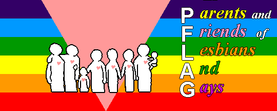
I can only say that this not right: these people have a very nice flag as
their logo, and then go out on the streets demonstrating
with… this! I mean, it is not only ugly, but wrong: the stripes are
upside down, there’s indigo instead of purple,
the lettering is confuse and misplaced, and the ratio (2:5) is unwise (to say
the least). It is an one off banner, anyway; if the P-flag ever catch on, as a
sign of parents and friends of gays and lesbians, it will be almost certainly
in the version used as logo: the usual gay rainbow with a
large black "P" at the hoist separated from if by a pink bar.
António Martins, 22 Jul 1999
Hosted by: Fanshop-Online.de und Handy-Shop.de
Tip: Apple iPhone 6s und Samsung Galaxy S6