
image by António Martins, 13 Aug 2007

FOTW beschäftigt sich mit der Wissenschaft der Vexillologie (Flaggenkunde).
Alle auf dieser Website dargebotenen Abbildungen dienen ausschließlich der Informationsvermittlung im Sinne der Flaggenkunde.
Wir distanziert uns ausdrücklich von allen hierauf dargestellten Symbolen verfassungsfeindlicher Organisationen.
Last modified: 2017-03-30 by antónio martins
Keywords: interlingua | iala | no flag | breinstrup (henrik) | i | globe | podrazil (karel) | star: 4 points (white on red and blue) | sky | earth |
Links: FOTW homepage |
search |
disclaimer and copyright |
write us |
mirrors
See also:
Interlingua, said of IALA (International Auxiliary Language Association) to
distinguish it from Interlingue, achieved
remarkable success and acceptance — even if modest compared with those of
Esperanto. It is the most refined application of the
“cosmopolitan” approach for an aprioristic constructed language,
based on previous language knowledge of the user and focusing primarily on
passive usage, contrasting with Esperanto’s
“internationalism” and “democracy”.
António Martins, 05 Jun 1999
Rodríguez [rod97] says that, although
Interlingua apeared in 1951, no logo was officially adopted yet. However 14
proposals were published in 1991, during the language’s 40th
anniversary.
António Martins, 05 Jun 1999
In Panorama in interlingua 1/1991: p.9 [ial91], reader Helmut Ruhrig mentions as emblems of (or for?) Interlingua two further designs:

A real flag, even if only as a proposal, is Karel Podrazil’s: Presented in Panorama in interlingua 1/1990: p.6 [ial90], as a first version of an emblem consisting of a four-pointed star faceted in blue (vertical clockwise sides), red (horizontal clockwise sides) and white (remaining sides).
In Panorama in interlingua 6/1990: p.6 [ial90a], this preexistent design is shown simplified, with a white four-pointed star on a horizontally divided background, blue over red, stating in support i.a. that it can be easily made into a flag: «Pote esser usate o como insignia o como bandiera sin modification» (= «can be used both as a lapel pin and as a flag, with no changes»), though it is illustrated only on a round emblem.
The associated symbolism would be sky over earth, as in «le blanc stella de interlingua penetra tote le mundo e pro alcun nationes illo es linguisticamente plus proxime, ma pro altere nationes illo es linguisticamente plus lontan» (= «Interlingua’s white star penetrating the whole world, being for some nations linguistacally closer, and farther to others»), which might not be Interlingua’s best argument.
António Martins, 13 Aug 2007
(conjectural flag design)

image by António Martins, 13 Aug 2007
This is one of the 14 designs proposed in 1991 mentioned in
[rod97].
In this conjectural image I used the colors and arrangement of the
European flag, whose philosophy is kin to the
“cosmopolitan” ideas of the adepts of this language.
António Martins, 05 Jun 1999
Leafing through the 1990-1991 yearly collections of magazine Panorama in
interlingua, (which is in Interlingua) I found plenty of evidence of
this design: It was doubtlessly authored by Henrik Breinstrup, leading Danish
interlinguaist and redactor of the magazine and was argued for in Panorama
in interlingua 1/1991: p.9 [ial91].
It was published in Panorama in interlingua 6/1990: p.1 (with
Christmas greetings in ribbon) and in Panorama in interlingua
1/1991: p.1,13 (as the 40th jubillee cartoon / logo, with dot replaced
by champagne cork); it was probably used throughout the year 1991 in this
magazine and other media. Still no idea of flags, nor support for my
conjectural coloring.
António Martins, 13 Aug 2007
(conjectural flag design)
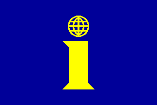
image by António Martins, 05 Jun 1999
This is one of the 14 designs proposed in 1991 mentioned in
[rod97].
In this conjectural image I used the colors and arrangement of the
European flag, whose philosophy is kin to the
“cosmopolitan” ideas of the adepts of this language.
António Martins, 05 Jun 1999
Leafing through the 1990-1991 yearly collections of magazine Panorama in
interlingua, (which is in Interlingua) I found plenty of evidence of
this design, though with a regular dot on the "i"
(actually, an "ℹ"), not a globe grid.
António Martins, 13 Aug 2007
(conjectural flag design)

image by António Martins, 05 Jun 1999
This is one of the 14 designs proposed in 1991 mentioned in
[rod97].
In this conjectural image I used the colors and arrangement of the
European flag, whose philosophy is kin to the
“cosmopolitan” ideas of the adepts of this language.
António Martins, 05 Jun 1999
Leafing through the 1990-1991 yearly collections of magazine Panorama in
interlingua, (which is in Interlingua) I found no mention of the
design reported in [rod97], the one that looks
like "(I)" (a cat’s eye?).
António Martins, 13 Aug 2007
Anything below this line was not added by the editor of this page.
Hosted by: Fanshop-Online.de und Handy-Shop.de
Tipp: Apple iPhone 8 Plus