 klaus-michael schneider
Keywords: education |
Links: FOTW homepage | search | disclaimer and copyright | write us | mirrors

FOTW beschäftigt sich mit der Wissenschaft der Vexillologie (Flaggenkunde).
Alle auf dieser Website dargebotenen Abbildungen dienen ausschließlich der Informationsvermittlung im Sinne der Flaggenkunde.
Wir distanziert uns ausdrücklich von allen hierauf dargestellten Symbolen verfassungsfeindlicher Organisationen.
Last modified: 2021-08-26 by  klaus-michael schneider
Keywords: education |
Links: FOTW homepage |
search |
disclaimer and copyright |
write us |
mirrors
See Also:
 image by Ivan Sache, 29 October 2014
Colegio Parroquial Emaús was established in Medellín (Antioquia Department)
on 17 April 1995 by the priest of the parish of Nuestra Señora de Guadalupe,
Jorge Alberto Galeano Buitrago (d. 2001), with the administrative support of
Iván Salazar Duque (d. 2009). Colegio Parroquial Emaús took over in 2004 the
school established in 2000 by the priest of the parish of La Pasión (Nuevo
Horizonte borough), Luís Emilio Flórez Buitrago.
The flag of the institute is horizontally divided white-blue with the
institute's coat of arms in the middle. White means the search for social
interaction based on values. Blue is an elegant, serious, joyous, safe, and
tranquil colour. It is a symbol of intelligence, knowledge, and deep truth. This
colour represents the great munificence of the Creation and is a Marian allegory.
Source:
http://colegioparroquialemaus.com/bandera.html - Institute's website
The coat of arms of the institute features:
- a shield vertically divided white and blue. These Marian colours recall the
strong connection between the institute and the parish. The style of the shield
is borrowed form the arms of the Medellín Archdiocese.
- a heart, alluding to Luke 24:32: "They asked each other, 'Were not our hearts
burning within us while he talked with us on the road and opened the Scriptures
to us?' "
- a crown of thorns surrounding the heart, as a vivid reference of the love of
Jesus for mankind, supplying sacrifice and generosity, the values that children
and teenagers shall practice. The crown also represents the difficult situation
of the youth and the death of several of them during periods of violence.
Preserving values requires part of sacrifice in a society like ours.
- sun rays forming the heart's background, as a symbol of youth that spreads to
the society the fundamental values required to be and to live. They recall the
evidence that children and teenagers should provide to the society as a
testimony of the resurrection.
Source:
http://colegioparroquialemaus.com/escudo.html - Institute's website
Ivan Sache, 29 October 2014
 image by Ivan Sache, 28 September 2018
Colegio Emanuel was established in May 1987 in Florida (Valle Department), as
Jardin Infantil Personitas, by Alex Otalvaro and Bertha María Nieves. In 1005,
Unión Misionera Evangélica purchased the school from Isabel Garcés Andrade,
renamed it to Colegio Emanuel and maintained Garcés as the director. She was
succeeded by Ruth Garcés Andrade and, since 2003, Bertha María Nieves.
In the
Bible, Emmanuel means "God With Us", therefore the school's name reflects its
philosophy.
http://www.colegioemanuel.edu.co/
School website
The flag of
Colegio Emanuel is horizontally divided celestial blue-white-olive green. Blue,
a cold color, is a symbol of meditation, truth and knowledge. White, as the
symbol of peace, means purity, transparency, and harmony with celestial blue.
Green means freshness and spring, symbolizing hope and youth.
http://www.colegioemanuel.edu.co/PW8/?page_id=119
School website
Ivan Sache,
28 September 2018
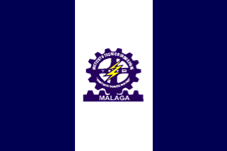 image by Ivan Sache, 12 December 2020
Instituto Tecnico Industrial Emeterio Duarte Suarez is located in Malaga
(Santander).
The flag of ITI Emeterio Duarte Suarez is vertically divided
blue-white-blue with the school's coat of arms in the center.
Ivan Sache, 12 December 2020
 image by Ivan Sache, 08 November 2014
Colegio Emiliani is located in the Santa Ana borough, part of the
municipality of Tunja (Boyacá Department). The institute is name for St.
Gerolamo Emiliani (1481-1537; canonized in 1767 by Pope Clement XIII and named
in 1928 patron of orphans and abandoned children by Pope Pius XI), founder in
1532 of the congregation of the Regular Clerics (Somaschi).
The flag of the institute is horizontally divided blue-red-green. Blue is a
symbol of Marian spirituality. Red is a symbol of love, as represented by Jesus
Christ shedding the last drop of his blood on the cross. Green is a symbol of
hope in the youth.
Source:
http://www.colegioemiliani.edu.co/index.php/acerca-de-nosotros/escudo-bandera-emiliani-tunja
- Institute's website
Ivan Sache, 08 November 2014
 image by Ivan Sache, 26 July 2018
Colegio Emmanuel d'Alzon was established in 1955 by Fathers Theophan Couvert,
Jorge Ringoet and Pascual Collin, members of the order of the Augustinians of
the Assumptians, a congregation founded in 1845 in France by Emmanuel d'Alzon
(1810-1880).
The flag of Collegial Emmanuel d'Alzon is vertically divided
yellow-white
http://emmanueldalzon.edu.co/el-colegio/
Collegial Emmanuel d'Alzon
website
Ivan Sache, 26 July 2018
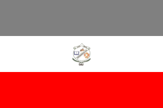 image by Ivan Sache, 11 October 2018
Liceo Mixto Emperador de Cali (LIMEC) was established on 14 June 1993.
The flag of LIMEC is horizontally divided gray-white-red with the school's
coat of arms in the center.
Grey represents hope, confidence and
optimism. White represents transparency, peace and loyalty. Red represents love,
force and solidarity.
https://www.liceomixtoemperadordecali.co/himno-del-limec
School website
Ivan Sache, 11 October 2018
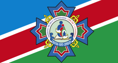 image by Ivan Sache, 16 March 2019
Institución Técnica Empreserial Crecer y Construir [To Believe and to Grow]
(ITECC) was established on 1 February 1996 in borough Bariloche II, Piedecuesta
(Santander Department), as Instituto Pedagógico Crecer. The school's current
name was adopted by Resolution No. 17,058 issued in November 2005.
The
flag of ITECC is diagonally divided blue-red-green from the lower half to the
upper hoist with a white fimbriation between the colored stripes, and the
school's coat of arms all over.
Blue is the predominant color in the world,
the Earth being known as the blue planet. Most human beings need blue. This
color induces in students a feeling of calm and alleviates life's pressure and
turmoil; it permits a connection with the excessive environment laden with
stimuli most of us are exposed to. Blue also represents God's will, force, power
and divine protection.
Red represents academic dignity, meaning action,
energy, vigor, strong-mindedness, valor, leadership, force to reach goals, love
for study and dynamism required to interact with knowledge.
Green is a symbol
of hope, faith, friendship and continuous quest of lore and knowledge in a
progress society; it induces tranquility, promotes balance and self-control.
Infusing security, this color is used not only in the school's flag but also in
classrooms where new and creative ideas are generated.
The white fimbriation
represents safety, purity and transparency of human talent and academic process.
It is also a symbol of the peace that should reign in the educational community.
The coat of arms of ITECC is composed of:
- a four-pointed star with the
school's colors: blue, red and green, which symbolizes the four components of
institutional development (institutional horizon, pedagogy, administration,
projection to the community).
- four yellow awls, which represent the
fundamentals and institutional principles, symbols of the spiritual resources of
the students.
- a white ring inscribed with the school's name in blue and red
letters, charged in the lower part with a king blue scroll inscribed with the
school's motto [CREATIVIDAD - RESPETO- COOPERACIÓN / Creativity -
Respect -
Cooperation] in white letters.
- on a celestial blue background a special
emblem composed with a book in base, which represents lore and knowledge.
-
an icon made of four blue, red and green, human silhouettes, which represent
family and the student's evolution during the learning process.
- two
concentric arrows, which determine our pedagogic model, personalized and of
integral education.
- an open book, which symbolizes the progresses of
information, which are fundamental for knowledge acquisition.
http://www.creceryconstruir.com/micolegio/micolegio.php?txtId_contenido=17,
ITECC website
Ivan Sache, 16 March 2019
 image by Ivan Sache, 21 March 2019
Gimnasio Superior Empresarial was established in 2004 by Financiera
Comultrasan and Fundación Comultrasan, succeeding Colegio Cooperativo
Comultrasan (est. in 1968).
Comultrasan, formerly Coomultrasan, is
Cooperativa Multiactiva de Trabadajores de Santander, established on 21
September 1979. Financiera Comultrasan separated from the cooperative on 26 July
2009 for legal reasons. Fundación Comultrasan was established in 2002 by
Financiera Comultrasan.
The flag of Gimnasio Superior Empresarial is
white with the school's logo.
http://www.gimnasiosuperior.edu.co/sitio/index.php/institucion/simbolos,
School website
Ivan Sache, 21 March 2019
The EPN (Escuela Penitenciaria Nacional "Enriqe Low Murtra", "Enrique Low
Murtra" National Prison School ), is Colombia's formation institution for all
the personnel in charge of custody in penitenciaries around the country, mainly
employed by the INPEC. It was established by
Decree No. 1817 of July 17, 1964.
Source:
http://www.epn.gov.co/bienestar-estudiantil/historia-epn.html
Its flag is a green horizontal flag, crossed from top left to bottom right with
the colors of INPEC, white/red/green/, as seen
here. (first flag on the top left). The flag can also be seen
here on their offical website.
Source:
http://www.epn.gov.co/bienestar-estudiantil/identidad/120-bandera-epn.html
The flag was commissioned through Circular No. 31, of August 1984, by contest,
issued by the (then) Dirección General de Prisiones (today known as
INPEC), headed back then by Bernardo Echeverri
Ossa. The official measures of the flag are: 3m long, 2m wide.
Source:
http://www.epn.gov.co/bienestar-estudiantil/identidad/120-bandera-epn.html
The Coat of Arms is seen
here.
Source:
http://190.25.232.99/mdle/index.php?lang=en_utf8 ).
Additional information on the Coat of Arms can be found
here.
For additional information go to: EPN
(official website)
Esteban Rivera, 27 July 2012
 image by Ivan Sache, 18 November 2014
Institución Educativa Técnica Enrique Olaya Herrera was originally
established, as a boy's school, in 1946 in Guateque (Boyacá Department) by
Carlos Garzón and Luis F. Acevedo. Transformed into a Colegio Nacional by
Resolution No. 21,401 of 16 June 1952, the institute was renamed Colegio
Nacional Enrique Olaya Herrera by Resolution No. 5,313 of 27 October 1970, as a
tribute to Guateque-born Enrique Olaya Herrera (1880-1937), President of the
Republic from 1930 to 1934.
Institución Educativa Enrique Olaya Herrera was established by Resolution No.
1,732 of 19 July 2002 as the merger of Colegio Nacional Enrique Olaya Herrera,
Colegio Básico Hortensia Perilla and Concentración Urbana Mixta. Resolution No.
110 of 4 February 2010 renamed it Institución Educativa Técnica Enrique Olaya
Herrera, with a specialization in electronics. The institute took over
Institución Educativa Rural Julia Flores by Resolution No. 6,850 of 15 December
2011.
The flag of the institute is divided white-green according to the descending
diagonal.
Source:
http://www.enriqueolayaherrera.edu.co/#!nosotros/csgz - Institute's website
Ivan Sache, 18 November 2014
"Institución Educativa Entrerríos" is located at
Entrerríos, Department of Antioquia.
The flag of the institute is shown graphically and described on
the website of
the institute.
The description says that the flag is made of three equal
horizontal stripes green, white, and blue, while the drawing
shows a flag horizontally divided blue-white-green.
Green represents the municipality of Entrerríos and its
harmonious landscapes.
White represents peace and harmony.
Blue represents the institute, as on the emblem, where the blue
quarter is charged with the name and educative motto of the
institute, "Más que enseñar es formar" (Educating is
better than teaching).
Ivan Sache, 5 February 2009
 image by Ivan Sache, 28 June 2014
Previously reported flag:
 image by Ivan Sache, 7 November 2010
I recently wrote that the Colombian Theresian educational institutes could
share a common flag, horizontally divided white-blue. My assumption, based on
two samples, was erroneous.
Colegio Teresiano de Envigado is one of the seven Colombian institutes chaired
by the Community of St. Therese of the Child Jesus. It was founded in 1969 in
Envigado (Department of Antioquia) by Sister Maria del Pilar Suárez, the then
Superior of the Community in Colombia, as Colegio Teresiano Monteblanco. In
1999, the institute was renamed Colegio Teresiano de Envigado.
The flag of Colegio Teresiano de Envigado is presented on the institute's
website as horizontally divided light blue-white-coffee brown, with respective
proportions 2:1:1 - undoubtedly recalling the Colombian national flag. The three
stripes, placed "from the Earth to Heavens", symbolize the Theresian spirit.
Coffee brown represents integral education and the woman's representation in the
Theresian values. Light blue represents transcendency. The three colors together
represent prayer as a personal relation with God and the synthesis of the
Theresian humanism.
Source:
http://www.colegioteresiano.edu.co/pags/simbolos.htm
Ivan Sache, 7 November 2010
The flag of the institute is presented now on the institute's website
with equal stripes.
Source:
http://www.colegioteresiano.edu.co/simbolos
Ivan Sache, 28 June 2014
 image by Ivan Sache, 14 February 2004
Institución Universitaria de Envigado (IUE) is managed by Corporación
Universitaria de Envigado, established in 1992. Classes in Electronic
Engineering and Systems Engineering started on 10 February 1995. The institute
was officially established by Agreement No. 44 issued on 28 November 1996 by the
Municipal Council.
IUE is composed of the Faculties of Business Sciences, Law
and Political Sciences, Social Sciences, and Engineering.
https://www.iue.edu.co/
IUE website
The flag of IUE is composed of the colors of the municipality of Envigado,
green and orange, and of a white stripe alluding to social responsibility,
highlighted in IUE's mission statement as its central task.
The emblem of IUE
is composed of the institute's initials and of the following elements the Earth,
conveying the idea of open-mindedness to the world, and an atom representing
technology, science and vision of the future.
The motto reads "Science,
Education and Development".
https://www.iue.edu.co/la-iue/institucional/simbolos-institucionales.html
IUE website
Photos
https://es.slideshare.net/IUESistemaGestionIntegral/ceremonia-de-certificacin-institucin-universitaria-de-envigado
 image by Ivan Sache, 15 December 2020
A recent photo shows the
flag with inverted colors.
Photo
https://juanpaz.net/la-institucion-universitaria-de-envigado-da-su-primer-paso-a-la-acreditacion-institucional/
Ivan Sache, 15 December 2020
Hosted by: Fanshop-Online.de und Handy-Shop.de
Tipp: Apple iPhone 12 im Shop