FOTW beschäftigt sich mit der Wissenschaft der Vexillologie (Flaggenkunde).
Alle auf dieser Website dargebotenen Abbildungen dienen ausschließlich der Informationsvermittlung im Sinne der Flaggenkunde.
Wir distanziert uns ausdrücklich von allen hierauf dargestellten Symbolen verfassungsfeindlicher Organisationen.
Last modified: 2017-01-10 by klaus-michael schneider
Keywords: portuguese football federation | f.p.f. | cross: christ knights (latin) | quinas |
Links: FOTW homepage |
search |
disclaimer and copyright |
write us |
mirrors

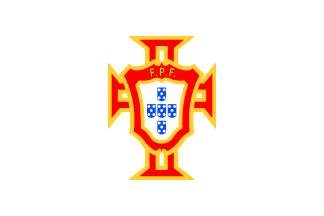
The Portuguese Football Federation is, as its name implies, the entity
that has the responsability to arganize portuguese football and represent
it abroad through the national selection. This, despite the fact that who
organizes the professional competitions (the two top divisions) is the
League of Professional Football, in cooperation with the Portuguese Football
Federation.
Jorge Candeias, 12 Nov 2001

The most common flags show still thick black lines delimitating the golden
fimbriations, just as the players show in their sweaters, but is also seen
frequently a variation without these lines, with the gold in direct contact
with the white cloth.
Jorge Candeias, 12 Nov 2001
![[FPF supporter flag (PT) ]](../images/p/pt@fpf_sou.gif) 2:3 image by Sérgio Horta,
2:3 image by Sérgio Horta,
Possibly it is an illegal yet somewhat official Portuguese soccer supporters' flag. The Portuguese Soccer Club Federation (Federação Portuguesa de Futebol, FPF launched a campaign titled "Sou Portugal" ("I'm Portugal") in whose disparate merchandise items flags is included a flag, only found within pages of National Post. for some reason they hard sell this patriotic nonsense and yet use in their website English words like "gifts" instead of "brindes".)
The flag that's part of the campaign "Sou Portugal" (not necessarily the flag of the campaign, if there's one) is a rip-off of the national flag with an unequal vertical partition of green and red, with the logo of F.P.F. itself on the dividing line (where the national coat of arms shows on the national flag) and the slogan "Sou Portugal" set in white extra bold serifless (apparently Futura XBlk BT typeface) capitals, on two lines, with "SOU" in very large size matching the width of the second line, "PORTUGAL" (which is as bad typography as it is bad vexillology - but call it design and anything goes); at the lower fly another rendition of the F.P.F. logo with the word "PORTUGA"L" again and a smaller line of text with what seems to be three letters - either "SOU" or "SER" (="to be").
The reverse is not shown, but is is probably an unreadable mirror image ("?A?UT?O? UO?"), as the cloth seems to be thin printed polyester. The exact specs of the flag seem to slightly deviate from the national flag, in aspects they would be supposed to match (ratio: slightly less oblong than 2:3; colours: maybe slightly lighter in the green and darker in the red),
This kind of things are forbidden by the spirit of the law that protects the national symbols (Decreto-Lei 150/87, namely articles 1.ş and 10.ş, see here[ http:// ]), but nobody seems to care (said law is on the other hand some times used to repress constitutionally protected manifestations of free speech in the context of protests and artworks).
António Martins-Tuválkin, 3 Dec 2016
back to Portugal sports flags main page click here
Hosted by: Fanshop-Online.de und Handy-Shop.de
Tip: Apple iPhone 7