 zachary harden
Keywords: ufe | unidentified flags |
Links: FOTW homepage | search | disclaimer and copyright | write us | mirrors

FOTW beschäftigt sich mit der Wissenschaft der Vexillologie (Flaggenkunde).
Alle auf dieser Website dargebotenen Abbildungen dienen ausschließlich der Informationsvermittlung im Sinne der Flaggenkunde.
Wir distanziert uns ausdrücklich von allen hierauf dargestellten Symbolen verfassungsfeindlicher Organisationen.
Last modified: 2023-11-25 by  zachary harden
Keywords: ufe | unidentified flags |
Links: FOTW homepage |
search |
disclaimer and copyright |
write us |
mirrors
Please note our Policy for Submissions and Enquiries.
Below is a series of images of flags that have been provided to FOTW; some we have recognized, and some we have been unable to recognize. If you can help us identify any of these flags, please let us know! Contact the: UFE Editor.
Identification Key:
Please help me identify this flag.
Jennifer Leslie, 7 January 2007
[This flag is very similar to UFE17-40, but missing the additional four stars added. There it is identified as a part a toy military set. - Ed.]
Speculative image by Peter Hans van den Muijzenberg, 25 October 2011
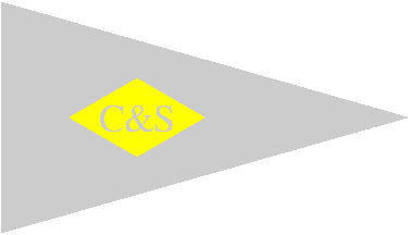
Could you please identify a flag on a uniform button as follows (if possible). The button is 22.5 mm diameter two-piece gilt spun back with the makers name Firmin, London on the back. It has a roped edge with an grommet inside that.- Lined background. The flag itself is a pennant on which is a diamond shape. On the diamond are the letters C & S. Unfortunately no colours are shown apart from the fact that the diamond has a deckled finish usually indicating in heraldic convention terms the colours of either yellow or orange. s a committee member of the British Button Society and a collector of shipping buttons for many years, I have had few problems in identifying the majority of buttons that come my way but this one really has me beaten - I had thought maybe a yacht or boat club burgee but somehow I don't think so. Unfortunately the backmark used by Firmin covers a number of years so pinning it down to a particular period is difficult- all I can suggest is that it could be any time post WW1 up to just after WW2 (early 50's).
Ian Scott, 9 January 2007
I've been in contact with Ian Scott, who asked us about this flag originally, and he wrote me on 10-10-2011 saying: "The button was identified a couple of years ago belonging to Cook & Son Nile Service Steamers. This is the famous Cook who really started the tourist trade in the mid-19th Century, but obviously they expanded and an obvious area was the river nile and the pyramids, etc. I believe someone spotted the flag on an advertising poster for holidays on the nile and the rest as they say is history."
With Ian Scott's help, I've created an approximation of the flag. As the background of the button has colour indicated, and the diamond has as well, I was tempted to say the field is meant to be white, for not having any colour indication. But it's an unlikely choice, so I stuck with the grey I tend to use for unknown details.
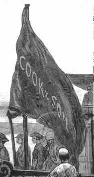 Image #2 from Peter Hans van den Muijzenberg, 25 October 2011 (Click to enlarge)
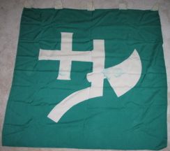 Image provided by Nelson Schmitt
I picked this flag up at an estate sale. I'm pretty sure it's Japanese and most likely WWII era. The previous owner was a WWII collector and dealer. Do you have any idea what flag it could be? I'm not even sure which way is up or whether it is flopped the right way. The top of the image is where it fastens to the pole but I don't know if it hangs down or outwards. Japanese flags seem to hang both ways.
Nelson Schmitt, 10 January 2007
This flag is a former version of the German KLJB banner. It was used up through the Nineties. KLJB means "Katholische Landjugend-Bewegung" (Catholic Farmer's Youth Movement), a large German catholic association for young farmers, founded in 1947, with 70.000 members today.
Werner Bußmann, 12 September 2011
The current logo can be viewed at Katholische Landjugendbewegung Deutschlands - Movement of the Catholic Rural Youth of Germany. (The following has been translated from submitted German text and paraphrased by the UFE Editor) The KLJB is among Germany's largest youth organizations with 70,000 members. Since 1947, the KLJB has represented the interests of young people in rural areas and is committed to an active and vibrant Catholic Church. In accordance with its guidelines, the KLJB supports a just and sustainable world and wants to be an example for eco-action, conservation and solidarity with people around the world. Its membership consists of young people and young adults 14 years or older. The KLJB headquarters are in the Bad Honnef Rhön village. Sources: http://de.wikipedia.org/wiki/KLJB and http://kljb.org/portraet.
Esteban Rivera, 24 September 2011
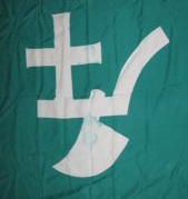 Image rotated by UFE Editor
It should be noted that this flag was NOT intended to be be hung vertically, and that the strange-looking "axe" was actually a cross and plow.
Ned Smith, 27 September 2011
Can you help identify any of these badges? I think the "A" is Alaska Shipping, but the rest are unknown to me.
John Gorto, 7 February 2007
The blue flag with white cross and red diamond is the house flag of the Isthmian Steamship Co. and is identified on its proper page.
The flag with the white A on the blue circle on the red field is the flag of the Alaska SS Co. and is identified on its proper page.
The blue flag with red R on white diamond is that of C. Rowbotham & Sons (Management) Ltd. and is identified on its proper page.
The white swallowtail with a black "P" is the house flag of the Panama Railroad Steamship Co. and is identified on its proper page.
USBF stands for United States Bureau of Fisheries. (It also stands for United States Bridge Federation and United States Bocce Federation, but I don't think these run shipping lines).
Lesley Prince, 9 February 2008

Speculative image by Peter Hans van den Muijzenberg, 31 October 2011
I collect flag pins and recently acquired one interesting pin. It's a triangular flag - there's a red disc in the middle and blue rays on white background. If it were red rays I'd say the flag was Japanese. But this has left me in wonder.
Bojan Kotur, 8 February 2007
For this speculative image, I didn't take "in the middle" literally, as it's usually difficult to determine on a triangular flag, and I've picked 2:3 for the ratio, which gives it a rather burgee-like look. Unfortunately, I've not been able to contact Bojan Kotur for confirmation.
Peter Hans van den Muijzenberg, 31 October 2011
I've been searching and even thought I had a good lead with an Italian line, but no matches. Anything like this in your House Flag memory?
Steve Conroy, 15 February 2007
I recently bought a painting of a sailing ship (see this photo), which as you can see is a merchantman built, I imagine, about 1850. I'm not a sailor, even less an historical naval architect, and have no idea from the look of the ship where it might have been built or owned. Nevertheless I would like to know a little more about it, particularly whose house-flag is flying at the mast redrawn above. [The flag on the painting is not clearly identifiable, but I have been assured closer examination reveals it as shown here. - editor]
Rodney Russell, 28 February 2007
 #8a
#8a  #8b
#8b
Image #8a belonged to the shipping line of N.J. Goulandris Brothers Ltd. and is now identified on its proper page.
Image #8b has been identified as the flag of the Odd Godager & Company of Oslo, and is now identified on its proper page.
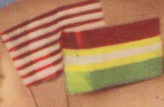 Image by Alan Rae, 5 March 2007
I am trying to identify two flags, which are shown on a pack of playing cards I bought while in Germany. The playing cards were made in Austria and judging from the styles of pictures on the cards they were probably photographed in the
thirties or forties. I have gone through your web pages and the flags have similar colouring to those of Hungary and Austria, but I could not find a match and I imagine that there was a considerable redrafting of flags in Europe in first half of the twentieth century. I have attached a scan of the flags and would appreciate any pointers you could give me to help me trace the flags and a period.
Alan Rae, 5 March 2007
I suspect that these are generic designs so chosen as not to be any national flag of the time.
Rob Raeside, 5 March 2007
These might be supposed to be the flags of USA and Bolivia. The US-flag was simplified to just 13 stripes without the blue canton and the stars. The white stripe in the Bolivian flag may be just a printing error.
J. Patrick Fischer, 6 March 2007
The red-white striped flag has thirteen stripes similar to the Merchants Flag of the American colonies, but the stripe width is not consistent.
Pete Loeser, 12 December 2009
This has been identified as the Vietnam Veterans Eagle Feather flag.
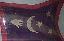 Image by Claude and Bernard Sache, 9 April 2007
The attached photograph was taken by my parents last year in the Bukhara History and Local Lore Museum, housed in the Ark Citadel. The flag is shown in a window together with old weapons; there is no caption and nobody there was able
to say anything on the flag. The flag is green (most probably, in spite of looking black) with a red border and white charges, from left to right, the left hand of Fatima, horizontal and pointing to the hoist; a crescent pointing to the hoist; and three stars in a triangle, one "inside" the crescent and the two other ones placed vertically near the flag fly. The stars seems to point to the upper left corner of the flag but this is not sure since the flag is partially folded. These charges are also shown on the flag of the
Emir of Bukhara from the early XXth century.
Bernard Sache, 9 April 2007
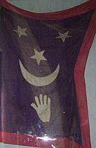

Images located by Nombre Apellido, 11 June 2021
This is a Bhukhara military flag (not official). It is indeed from the Bukhara History and Local Lore Museum. A similar ceremonial flag is shown in the display case in the second picture.
Anonymous, 11 June 2021
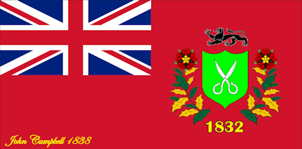 Speculative image by Daniel Lundberg, 30 June 2016
I have purchased a silk flag that I have been unable to identify. It is 6ft. x 3ft., burgundy back ground with a shield in the center (light green color) with scissors on the shield and a lion above the shield. Surrounding the shield on both sides branches with large leaves that resemble holly leaves (green and gold) and at the top of this branch it resembles a poppy flower. There is a union jack in the upper left corner. At the bottom of the flag the date 1832 is embroidered. In the lower left corner, embroidered, is the name John Campbell, 1838. Any information would be greatly appreciated.
Sharon, forwarded by Al Kirsch, 15 April 2007
Above is a rough idea of what the this flag may have look like. I attempted to follow the description given.
Daniel Lundberg, 30 June 2016
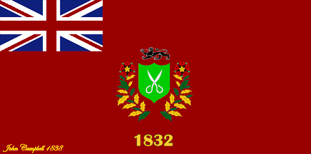 Speculative image by Peter Hans van den Muijzenberg, 2 July 2016
I moved the elements around a bit and re-coloured them slightly, for a better approximation of the description. I don't believe in red flowers on a red background, and the description is unclear about whether it's supposed to be a single flower or one per side.
But apart from that: The "name, year" embroidery suggests that this specimen was gifted that year to someone. On the other hand, the year below the charge would suggest the donating entity existed since 1832. Are there limits to what type of entity this could be?
Since they're using a flag that seems based on a UK red ensign, does this limit them to the UK, colonies, public entities, ...?
If we can get in contact with Sharon, I expect in this day and age it would be possible for her to provide us with a photograph.
Peter Hans van den Muijzenberg, 2 July 2016
I have have no way to follow up. Someone asked me about it (I'm a flag "expert" at AllExperts) and I passed it on to the list as a UFE. And there it sits. I admit I'm still stumped.
Al Kirsch, 11 July 2016
This flag was identified as an Industrial Honor Flag of the Third Liberty Loan campaign and located on it's proper page.
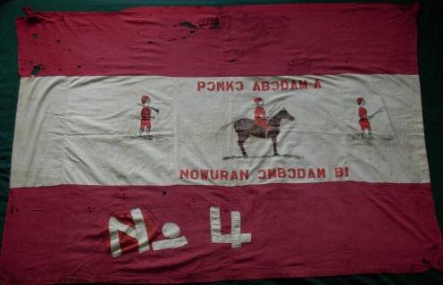 Image seen on eBay by Bill Garrison, 15 April 2007
Seen on eBay - listed as "Flag, Russia, Civil War (1920s?), Regiment?" What is
this?
Bill Garrison, 15 April 2007
I'm not an expert on the subject but after a quick look at the Cyrillic alphabet, there doesn't seem to be an "inverted C" or "N" as on the flag so it is probably another alphabet.
Marc Pasquin, 15 May 2007
There certainly isn't an inverted C, Neither is there an "I", although that is used in some Cyrillic-influenced scripts such as Ukrainian and (IIRC) Serbian. for some reason (possibly the costumes of the people on the flag) I suspect it's actually Balkan rather than Russian.
James Dignan, 15 May 2007
It has flipped letters, so it must be Russian. Much simpler than do a quick search for "reversed C" and learn all about the "Ɔ"/"ɔ", which is BTW a kind of "o". This letter is used in many orthographies, especially in Africa (see e.g.
http://www.bakweri.com/2004/03/the_mokpe_alpha.html), and therefore call it "African UFE" would be a better hint. I would guess that this is one of those relatively rare canton-less Fante Asafo _frankaa_ (see Asafo company flags), but I may be wrong. Note that there's question marks for the date and regiment, not for the spurious and baseless attribution to Russia.
António Martins-Tuválkin, 16 April 2007
This flag has a text in Ashanti (Ghanese language) starting with "PONKO ABODAM" which means Crazy Horse (according to
http://prempeh.org/points/houses.html).
Sven S, 26 September 2008
Since the text on this flag seems to have been "positively" identified as Ashanti would it be better to also put this UFE on the Ashanti-related Page as an UFE? Having the two flags cross-linked might allow someone knowledgable enough about Ashanti flags to ID one, then just maybe the odds would be a bit better that he/she could ID the other. Seems to me it would be best that we present both UFEs together.
Ned Smith, 4 May 2010
This is an Asanthe-Asafo-Fante flag. It is described as an early painted example, possibly from the Victorian era, of a Fante Asafo Vintage Military Company Flag. The Fante/Fanti Asafo lived in the area of the Gold Coast of West Africa alongside the Ashanti, in what is now Ghana, and were formed into military companies for defense. They used many such flags to distinguish their various military companies or regiments. (sourse).
Anonymous, 12 July 2021
I recently came across two flags that I was told were possibly WWII Naval Japanese flags. They are supposed to be some sort of signal flags from what I was told.
Rick Thompson, 5 May 2007
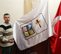 Image located by Ned Smith, 20 May 2007
The Nov 27, 2006, online edition of Christian Post has an article on the small Protestant congregation in Turkey. Included in the article is a photo of what is described as "a Protestant flag" next to the Turkish flag. www.christianpost.com/article/20061127/23701.htm. The flag is white, with 2 adjoining squares in the center, outlined in black. Both boxes have white backgrounds. In the square toward the hoist side is a black Latin cross, with a gold shroud draped over the cross piece and passing in front of the upright. Surrounding the top of the upright are red flames. The square toward the fly side bears within it a 4-part logo, consisting of four smaller black-bordered squares, arranged into an intermediated sized square. Starting at the top, fly side (which is on the viewer's left in this photo) and going clockwise:
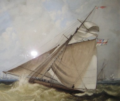
Orginal Photo of watercolour from Robert Dean, 16 June 2007
Speculative image by Pete Loeser, 23 January 2011
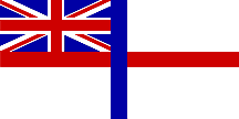
I have recently bought a watercolour, mid 19 century, of a yacht flying the White Ensign (post 1801) save that the vertical bar of the St George's Cross is blue, not red. The vessel also has a Flag Officer's pennant with the blue
vertical bar, and otherwise a red cross on a white background. Any ideas? Many thanks.
Robert Dean, 16 June 2007
I have no information about a White Ensign with a blue vertical arm on the St George's Cross (and no burgees of current yacht clubs appear show such a device), however, various White Ensigns of the St George's type were in use by yacht clubs between 1829 and 1842. According to Perrin (PP 137-9) The Royal Yacht Club (later the Royal Yacht Squadron of course) received a Warrant in 1829 and still flies the White Ensign, while the Royal Western, the Royal Thames, the Royal Southampton, the Royal Eastern and the Gibraltar Yacht Club had their's withdrawn on 22 July 1842. Due to an oversight the Royal Western Yacht Club of Ireland was missed and continued to fly theirs (which had a crown and wreath of shamrock in the centre) until 1859.
Christopher Southworth, 20 June 2007
The Royal Yacht Club of Tasmania's burgee is white with a bi-colour St George's cross. In this case it is the vertical arm that is red and the horizontal arm that is blue, with a crown at the centre of the cross. The club was founded in 1880 as the Derwent Yacht Club. It was not granted the title "royal" until 1910, so it is unlikely that the burgee bore a crown before that, and it may possibly have differed in other ways.
David Prothero, 22 June 2007
 Image by Rob Raeside
UFE07-18 has been identified as a Canarian Political Flag used by those against Canarian independence, combining the Spanish and Canarian Flags, and is now on its proper page.
 #19e
#19e
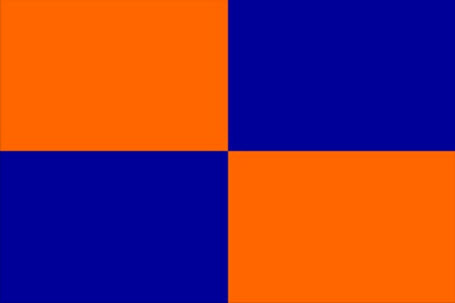
Speculative images using banneristic numbering by Peter Hans van den Muijzenberg, 17 May 2015
I have several new flags that I don't know what they are. Can you help please? They are all 100% cotton, 2' x 3', and they have a number RN32335. All colours are solid blocks.
Could "RN" be the (British) Royal Navy, and these a set of signal flags, for semaphore, maybe?
António Martins, 10 May 2010
I feel that the poster, Mr. Flag, was numbering in the banneristic way, clockwise, not the heraldic way, writing-wise.
I still can't figure these out, though. I wonder whether Mr. Flag knew where he got them from. You'd think they were sports signals of some kind, but who would need such complicated signal flags?
Peter Hans van den Muijzenberg, 15 April 2015
[Editorial Note: Peter Hans also noted that at UFE14-73 the same number, RN32335, was apparently used.]

This has been identified as the flag of the Berlin rowing club Ruder-Verein Freya e.V.

 Image from David Prothero
UFE07-22 was the flag of the Royal Yachting Association and is now located on its proper page.
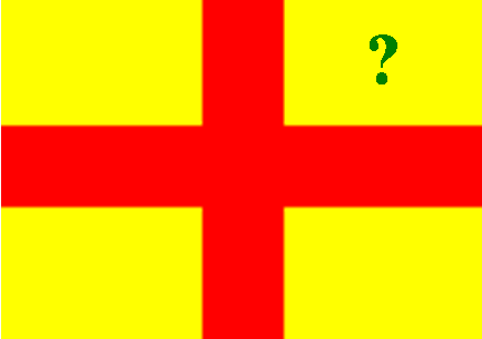 Speculative Image by Pete Loeser, 19 January 2010
I briefly saw a flag I'm trying to identify, it was all yellow with a red cross crossing it and in the top right corner was some sort of green emblem. Any ideas what type of flag it could be?
Submitted to Albert S. Kirsch as an All Experts question, 31 July 2007
Every time I see this image, I can't help thinking I'm looking at the reverse side of the flag and the missing green emblem is in the canton, whatever it might be.
Pete Loeser, 30 September 2014
It need not be the reverse, as all we seem to have is "top right corner". Whose right that is, we don't seem to know, so the illustration may or may not be correct.
Peter Hans van den Muijzenberg, 30 September 2014
This is the flag of Polk County, Iowa.
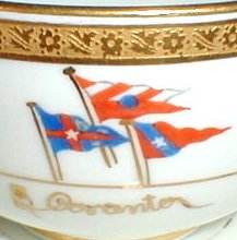
These flags have been positively identified as those of the New York Yacht Club and the Rhode Island Yacht Club. The gold encrusted cup and saucer set, manufactured by the Cauldon China Company, was for use on board the steamer "Coranto." The top flag is the private signal flag of A. E. Austin, the owner of the steamer and a member of both the New York Yacht Club and the Rhode Island Yacht Club.
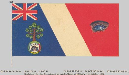 Image submitted by Roger Moyer, 6 August 2007
From a Canadian stamp company auction (vanceauctions.com)
described thus: 89, Tied by 1909 RPO cancel on rare PATRIOTIC POSTCARD depicting "THE CANADIAN UNION JACK" flag. Previous owner said this is an unrecorded patriotic postcard design! Addressed to United States. VF, crease at LR
Roger Moyer, 6 August 2007
It seems likely to me it is has a connection with freemasonry. The handshake beneath the tree, and especially the eye, are classic Masonic symbols. The device above the handshake looks as though it could be a Beavers' Lodge, but
that might suggest that freemasons have a sense of humour. However, can anyone suggest what the three colours of light blue, yellow and red might represent?
André Coutanche, 9 August 2007
There are 11 maple leaves shown. I can't make out the topmost. The others are (I think) MAN, ONT, QUE, NS, NB, PEI, ALB, SAS, BC, NWT. But the one at the top of the tree looks like COM or CON (definitely not CAN). Can anybody tell what it stands for? And was it the flag or the postcard which was registered with the DoA (strange bureaucratic placement in either case).
Ned Smith, 9 August 2007
Let us note the obvious bit of symbolism - the combination of British and French colours - though we then need to explain why the French colours are slanted. You also need to ask about the top leaf and its abbreviation; I can't really answer (unless it's 'confederation'??), but I can confuse the picture even more - according to Wiki, at
http://en.wikipedia.org/wiki/Canada#Provinces_and_territories, Alberta and Saskatchewan weren't even provinces in 1904, the date shown for this flag (though I guess they could have been seen to be en route).
André Coutanche, 9 August 2007
I sent an email to the Agriculture and Agri-Food Canada, the current form of the Department of Agriculture. Their reply is as follows: "The Department of Agriculture Act, which received Royal Assent on May 22, 1868, assigned, in addition to Agriculture, the following subjects to be under the control and direction of the Department of Agriculture: Immigration and Emigration, Public Health and Quarantine, The Marine and Emigrant Hospital at Québec, Arts and Manufactures, The Census, Statistics and the Registration of Statistics, Patents of Invention, Copyright, and Industrial Designs and Trademarks. As federal departments were created to take over these subjects, they left the Agriculture portfolio. The last to go, in 1918, were Patents of Invention, Copyrights, Trademarks and Timber Marks, Industrial Design, Public Health and Quarantine. At Confederation there was already a well established Department of Agriculture with the infrastructure to handle the assigned duties, and also, at the time, immigration and public health had a great many quarantine issues attached which included animals and animal health and products and plants and plant health and products, so there would have been quite a degree of connection to these and matters agricultural."
So it seems that the registration of printed matter was a combination of a number of factors; 1) the Dept of Agriculture could handle the workload, and 2) Often, the matter had some relevance to agriculture, so the Department could keep on top of new developments. I have a book on the history of Western Canada published in 1906, registered with Agriculture.
Georges G. Kovari, 10 August 2007
I also contacted Agriculture and Agri-Foods Canada who suggested it might be a part of a flag-design contest, but there's no documentation to support this. Given the dates on the postcard, and from the abbreviations on the maple leaves of the tree, that idea (of a contest) isn't such a bad one! Included in those abbreviations are 9 provinces and 1 territory - all that had been formed at that particular time. The beaver design is quite similar to early postage stamps and even some current coins, which would be consistent with a patriotic use of that symbol in a context.
Bob Hunt, 10 August 2007
This Canadian flag belongs to some unidentified fraternal order. The date could be approximated by counting the provinces on the maple leaves in the tree. "Registered with the Department of Agriculture" only means that the image is copyrighted – for some unknown reason, probably saving money, the Minister of Agriculture was responsible for the Copyright Act in the late 19th and very early 20th centuries. The Masonic references are a bit of a red herring, as almost all fraternal societies ultimately take some inspiration from the Masons, but that doesn´t mean that there were ever any ties between them. The key to identifying the flag is the initials under the clasped hands in the oval badge. The "O" probably stands for "Order" as the word appears in the legal names of many such bodies – e.g. the Odd Fellows, Eagles and Elks to name a few which readily come to mind. I hope that this helps, but it remains necessary to go through lists of both defunct and existing lodges to determine what it is.
Michael Halleran, 2 January 2010
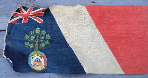 Image submitted by Mattias Hansson, 26 August 2010
I was asked by a Canadian acquaintance to identify this flag. I have not been successful so I was hoping to tap into the pool of knowledge that the members of this group has.
Mattias Hansson, 26 August 2010
We know this one as an UFE07-26, but it's nice to finally see this flag in the cloth. Can you help us out with any differences between the postcard and the actual item? And things like, measurements?
Peter Hans van den Muijzenberg, 26 August 2010
Sorry, I cannot help you further with things like measurements as I do not own this particular flag, but I have a very high-resolution photo and can definitely say that the letters say H.L.D.P. The top leaf in the tree says CON. which could perhaps stand for Confederation? The eye in the post card is not on the actual flag.
Mattias Hansson, 26 August 2010
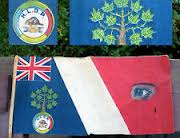 Image submitted by Peter Hans van den Muijzenberg, 19 February 2013
It gets more curious: A version of this flag appears to have been on offer on eBay some time ago. I can't find the actual entry, but the photograph and some text are still available in the search engines. Text: "Vintage 1940 flags CANADA Union Jack H.L.D.P. BEAVER & Provinces BEFORE THE TRUE."
I started wondering about the date. If we have a post card dated 1909, then at least the design won't be 1940 as indicated on eBay. But it's likely the design isn't from before 1905 either, as then the emblem would probably not have had leaves for Alberta and Saskatchewan. That leaves the question, though. Why is there no leaf for Yukon? What did it not have that the other provinces did have?
But now it gets weird. This flag on eBay does have the eye. But is it really on the flag, or is it a hole with the eye looking through from the surface behind it?
Peter Hans van den Muijzenberg, 19 February 2013
The post card is dated 1904, and we have a remark on the UFE page that the new provinces were presumably already anticipated at this point. As for Yukon, the obvious thing that it lacked was being a province. I don't know how normal it would have been in Canadian thinking to lump the territories together. If the emblem is a development of an existing design, Yukon might have even been ignored without such a conscious thought - with none thinking to update it when Yukon was created and not even thinking of it when adding leaves for the new provinces.
Jonathan Dixon, 19 February 2013
Looks more like a hole to me.
Tomislav Todorovic, 20 February 2013
The letters H.L.D.P. stand for Honneur, Liberté, Défense, Patrie and the abbreviation Con above the provinces stand for Confédération. This from a book called Canada et Canadiens (1908) by Adrien Loir.
Owen, 7 November 2015
The free e-book Canada et Canadiens in French (Pages 345-347) also mentions that it was designed by a French Canadian man named Léger, with a written description of the flag translated in this blog post, which strangely enough links back to this UFE page for the images of the flag.
Matthew Lewis, 30 March 2018
It is indeed a flag proposal submitted in 1904 (source) which was a hypothesis first mentioned by Bob Hunt on his August 10, 2007 post and confirmed by Matthew Lewis on his March 30, 2018 post. It is also likely that the flag was submitted and/or stored as "Canadian Union Jack Drapeau National Canadien (Canadian National Flag)" (proposal), so we should label it as such when included in the Canadian pages, which, IMHO, should be relocated here: "Canada, flag proposals".
Esteban Rivera, 31 March 2018

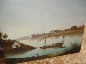 Images provided by Sal Giglia, 21 August 2007
Enclosed are shots of a painting containing a flag...any thoughts? I thought it could be Bohemia-Moravia but that flag is too young for this boat. The boat is I believe a opium trade boat of the 19th century when it was fashionable for the
French and English to frequent such exotic trips to the Mideast. Larger images can be seen at
http://www.flagid.org/vexphotos/ufe/DSC04706.JPG and
http://www.flagid.org/vexphotos/ufe/DSC06532.JPG.
Sal Giglia, 21 August 2007
Possibilities are Schaumburg-Lippe or Slovakia 1848-1868, when the order of the stripes wasn't fixed to W-B-R. Both are in the time frame, but are a bit unexpected.
Peter Hans van den Muijzenberg, 21 August 2007
Hosted by: Fanshop-Online.de und Handy-Shop.de
Tipp: Apple iPhone 15 im Shop