 zachary harden
Keywords: ufe | unidentified flags | 2018 |
Links: FOTW homepage | search | disclaimer and copyright | write us | mirrors

FOTW beschõftigt sich mit der Wissenschaft der Vexillologie (Flaggenkunde).
Alle auf dieser Website dargebotenen Abbildungen dienen ausschlie▀lich der Informationsvermittlung im Sinne der Flaggenkunde.
Wir distanziert uns ausdr³cklich von allen hierauf dargestellten Symbolen verfassungsfeindlicher Organisationen.
Last modified: 2023-06-03 by  zachary harden
Keywords: ufe | unidentified flags | 2018 |
Links: FOTW homepage |
search |
disclaimer and copyright |
write us |
mirrors
Please note our Policy for Submissions and Enquiries.
Below is a series of images of flags that have been provided to FOTW; some we have recognized, and some we have been unable to recognize. If you can help us identify any of these flags, please let us know! Contact the: UFE Editor.
Identification Key:
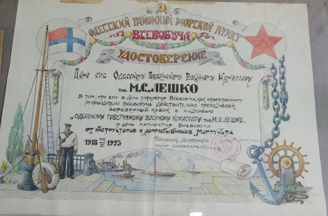
 Images from Victor Lomantsov, 1 February 2017
Especially for "flag detectives" - Third of several Russian flags. (Odessa
- modern Ukraine).
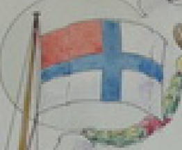
На рукописной почетной грамоте одесскому военному комиссару 1923 года от инструкторов Всевобуча (системы всеобщего военного обучения граждан СССР) изображен некий белый флаг с синим крестом и красным крыжом. Что это, пока не понятно... Всевобучем занимались в основном военные комиссариаты, т.е. скорее всего это флаг судов допризывной подготовки.
[loose translation] Found in a handwritten book honoring the Odessa Military Commissioner in 1923 written by the instructors of Vsevobuch (universal military training of citizens of the USSR). It depicts a white flag with a Blue Cross and Red kryzhom. Since the Vsevobuchem were mainly engaged with training military commissariats, most likely this flag [was used] on vessels [involved with] their pre-service training. (source) (image)
Victor Lomantsov, 1 February 2017
The original article reads: Одесситам показали указ о создании города и вековой герб (Odessites showed a decree on the creation of the city and the age-old coat of arms). It is about an exhibition displaying original objects from the history of Odesa, which even shows the Decree by which Odesa was established. The diploma was presented to М. (Михаил) С. (Степанович) Лешко (Military Commissar M.C. M.S. Leszko, or Leshko) and it is dated 1923. Perhaps this was an official document of the former Екатеринославская губернiя (Ekaterinoslav province), which lasted from 1802 to 1925, and the diploma states the years 1918-1923, perhaps the years in which the Commisar was in service. After the October Revolution of 1971, in the 1920s the губернский комитет (Provincial committee) was set up to help the sick and wounded Red Army soldiers, war and labor invalids and their families, headed by М.С. Лешко (M.S. Leszko), his deputy П.В. Шматковым (P.V. Shmatkov), and Secretary И.Я. Ластинкером (I.Y. Lastinkerom). The Председатель комитета (Chairman of the committee) was М.С. Лешко (M.S. Leszko) (source). Victor labels this flag as as a naval flag on his website.
Esteban Rivera, 7 February 2018

Image by Victor Lomantsov, 1 February 2017
Unknown maritime pennant of RSFSR (photo founded at internet shop AVITO.RU). Similar pennant exhibited in Museum of Amur Steamship Company.
НЕОПОЗНАННЫЙ вымпел с гербом РСФСР, обнаруженный на интернет-аукционе "АВИТО". Кстати, точно такой вымпел выставлен в музее Амурского пароходства. Возможно, он как-то связан с речным транспортом...
[Loose translation] UNIDENTIFIED pennant with the coat of arms of the RUSSIAN SFSR, found on an online auction site "AVITO". By the way, this is the same pennant that is on display at the Museum of Far Eastern Shipping Companies. Perhaps it is somehow linked to river transport.
Victor Lomantsov, 1 February 2017
Victor mentions he pennant is on display at the Museum of Far Eastern Shipping Companies, but the link provided is broken. Currently, the альневосточное морское пароходство (Far-Eastern Shipping Company) has been renamed FESCO, or the FESCO Transportation Group, or the FESCO Group (FESCO being the initials of the initial company) and the link by Victor could be redirected to "Trade Fleet Museum of FESCO".
Esteban Rivera, 7 February 2018
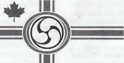 Image from Michael Halleran, 9 February 2018
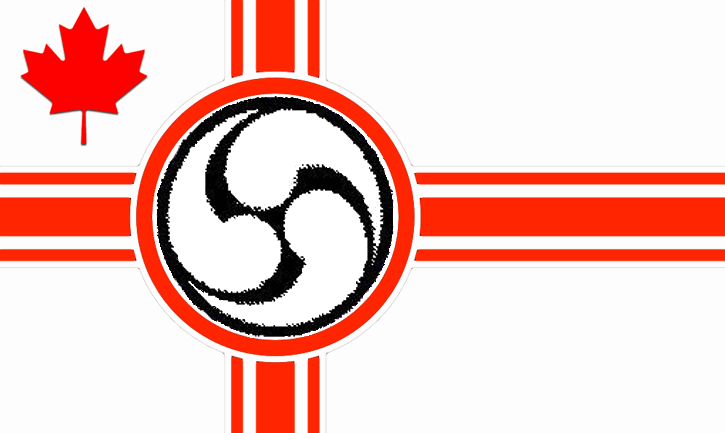
This afternoon numerous Neo-Fascist posters were affixed to the bus shelters at Fort and Douglas Streets in the centre of Victoria BC. When I arrived at the corner to change buses and saw them, they were in the process of being torn down by anti-fascists shouting "Power to the People!" I got a look at one, but was unable to grab it as evidence. The posters were printed in black ink on while paper. The showed photographs of an unknown (to me) 19th Century man and Adrien Arcand flanking a drawing of a flag. It was obviously modeled on the Imperial German Naval Ensign with a maple leaf (current Canadian flag pattern) substituted for the German tricolour and Iron Cross in the canton and a mandala of curved elements - seemingly rather vortex-like - in place of the German eagle in the centre circle. The rest of the poster was a lengthy racist rant against aboriginals, people of colour and Jews which stated among other things that Sir John A. Macdonald was a tool of "International Jewry" who had established a "Zionist Occupation Government". Unfortunately neither the Police or newspaper reporters were in evidence, so this may be the only written record of the event.
Michael Halleran, 5 February 2018
Further to my e-mail of the 6th. I have been able to obtain one of the posters and have photographed the flag. Possibly one of you may have seen it in a television news clip of a manifestation and can determine the actual colours. On examination of the poster, the previously unidentified 19th Century figure is Louis Riel - in the photograph he has a full beard, in the more common photographs he has a moustache, but no beard. The poster is captioned HAIL THE NEW DAWN and states that it is a Black Thorn Publication edited by "Pip Argot" (probably a pseudonym).
Michael Halleran, 9 February 2018
I'm not sure if this is helpful, but "Hail the New Dawn" is the second album released in 1984 by the British white power rock band Skrewdriver. The verses were a slightly altered version of the British Union of Fascists' party anthem. Perhaps this was a poster by some Canadian extremist group identifying with a British hate group?
Pete Loeser, 16 February 2018
 #21a
#21a
 #21b
#21b
Images from Pete Loeser, 4 March 2018
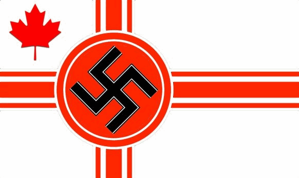
Although I have not identified your neo-Nazi group that put up the posters, I think I have solved the mystery of the flag. It appears that whoever designed the posters was a not-so talented or careful PhotoShoper. Apparently they started with another neo-Nazi fantasy flag (#21a) and attempted to paste their logo over the swastika, as illustrated in image #21b, thus ending with the image they used on their poster. Notice that the cut and paste job on their slightly enlongated flag image actual shows the remains of the red circle still showing behind the pasted image. I made no attempt to improve the pasted image as I also suspect this flag only exists in their imaginations, and does not have an actual or cloth version existing in the real world. I was unable to located the source where they borrowed the symbol they pasted on the pre-existing flag, but I'm sure it isn't original with them as I recall seeing it somewhere before. I also suspect this poster is the work of a very small group, or even a single individual.
Pete Loeser, 4 March 2018
 Normal Orientation
 Image flipped horizontally
Images by Pete Loeser, 22 March 2018
While I am not sure how it connects, I am certain the symbol in the middle is the mitsu tomoe, found in Shinto and Japanese culture.
Matthew Lewis, 17 March 2018
The original poster does not show the mitsu tomoe in black but rather greyish dots. I wonder if that does not indicate that it was intended to be in a colour other than black? It would be very easy for the person making the montage to connect the dots either digitally or with a pen and ink produce a black image, and it is noteworthy that it appears to be lighter than the red areas. I would suggest that it might be intended to be blue, given that Adrien Arcand and other Canadian fascists/nativists have tended to use red/white/blue rather than red/white/black to echo Gallic/Britannic roots rather than Germanic ones.
Also is the flag with the red maple leaf and cross with the black swastika that you suggested as the origin of the UFE 18-21 banner an actual flag, as it does not appear in in any list? If so, what group does it represent - there may be a connection?
Michael Halleran, 3 April 2018
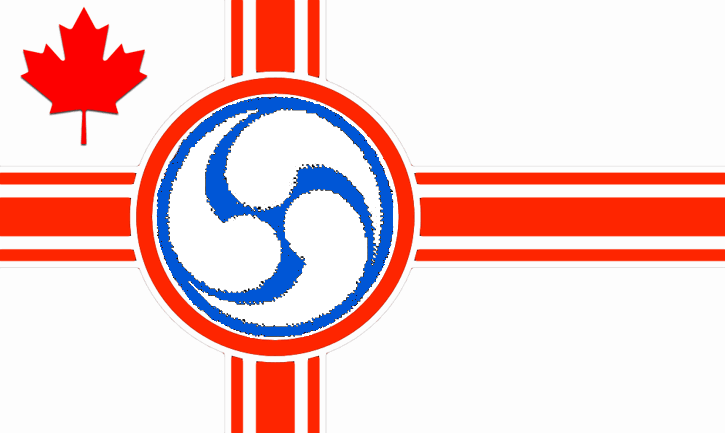 Speculative image from Pete Loeser, 4 April 2018
So perhaps it looks something like this? I found the original #21a on a Bing image search here.
Pete Loeser, 4 April 2018
If I understood correctly, you searched for Canadian Nazi flag on Bing (search engine) and it showed several results, among them is #21a, which I believe is perhaps the closest specimen to what we're looking for. Hence, we can conclude that this is (yet another) fictional flag.
Esteban Rivera, 14 April 2018
Yes indeed, throughout this whole thing it has only been a flag illustration that appeared on a bunch of Neo-Fascist posters hung up in Victory B.C. What we first were curious about is who was the unknown group that hung-up the posters. In my March 4th contribution I pretty much determined that somebody had combined several elements from several sources to "invent" a flag. I was illustrating how they did it. Then the discussion went a little sideways into what colors might be used if the flag actually existed in the real world.
Pete Loeser, 14 April 2018
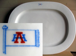 Image from Borut Kodric, 12 February 2018
Maybe there is someone who could please help me to identify this flag on a large and heavy serving dish (14 1/3" x 18 1/2" x 1 2/3" - - 36,5 x 47,0 x 4,0 cm). I've found the dish in the loft of my grandfather's house. It has on the rim a flag logo with a blue H and a red A letter in it. It is certainly over 70 years old, may be even World War I vintage. So far I've found no flag like this on the web. The dish was located in Triest (Trieste/Trst), now part of Italy, bordering on the Republic of Slovenia, but during World War I the town was the main harbour of the Austro-Hungarian Empire.
Borut Kodric, 12 February 2018
I suspect a passenger vessel. Any lines known from that era?
Albert S. Kirsch, 14 February 2018
I think the submitter has misinterpreted the letters, as I do not think they are modern Latin characters, but rather stemming from the Greek alphabet. This would mean that it is not H as in hotel but H as in 'eta, and not A as in alpha but Λ as in lam(b)da. This would fit with the geographical position given - Mediterranean sea - and the lack of a the horizontal bar in the Λ.
Technically, it could fit for the Cyrillic counterpart H as in ноябрь and Λ as in Лима, but then often another typographical styled "ell" is used as shown in the given example.
I tried searching for shipping companies, but quickly ran ashore. After all, it's all Greek to me. ![]()
Daniel Lundberg, 7 March 2018
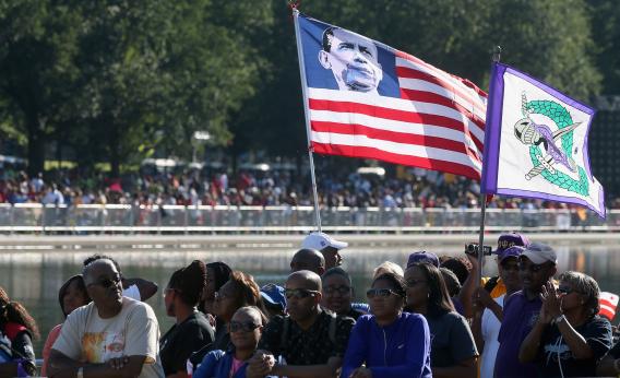 Image from Pete Loeser, 19 February 2018
I found this picture taken on the 50th anniversary of the famous March on Washington (also known as "The March on Washington for Jobs and Freedom") that occurred in August of 1963. It was the occasion that Martin Luther King Jr.'s now-iconic "I Have A Dream" speech was made to some 250,000 people gathered in front of the Lincoln Memorial. During the 50th anniversary march in 2013 apparently a modified US flag with President Obama's picture in the canton instead of stars was carried. Next to it another strange unrecognized flag was flown. It resembles both the colonial Bedford Flag or the unknown Revolutionary Battle Flag. Any opinions or guesses as to its identity?
Pete Loeser, 19 February 2018
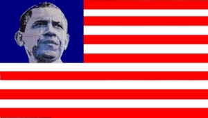 Image from Esteban Rivera, 19 February 2018 (source)
I know we're not looking for infomation on "President Obama's US flag", but I just thought I'd let you know about several other pictures of the flag being used, for reference purposes:
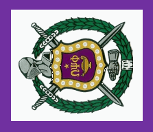 Image by Pete Loeser, 19 February 2018
 #24a
Image from Pete Loeser, 19 February 2018
A friend of mine, David Ott, says he has seen a flag used by Hispanics protesting Donald Trump's immigration policies. It has a white circle on a red field like the UFW flag, and the word RESISTO in black on the white circle. Has anybody else seen this flag?
Pete Loeser, 16 February 2018
According to (Source) the video available on the website of France 24, the protesters used a set of flags differing by the charge placed inside the white disc:
I think you got it correct. I've only seen these flags on TV and not very well, but I think some versions have had the word RESISTO on a yellow horizontal stripe on the white circle. Another version has something like SIN MIEDO on the circle. All of these flags do seem to be derived from that of the United Farm Workers.
David Ott, 19 February 2018
 #24b
#24b
 #24c
#24c
Images from Pete Loeser, 19 February 2018
According to my original source, David Ott, (and the French news video found by Ivan) the small handheld flags were used at a Dreamer Protest in Washington DC. In case you are not familiar with the term "Dreamers"" it refers to kids, many now adults, who were brought into the US illegally as very young children and raised in the United States, now fighting to be able to stay in the US, the only country they have really known.
The flags seemed to have been handmade with various circle designs glued on a red background. I attempt to draw the first three:
 #24d
Image by Pete Loeser, 19 February 2018
The forth flag (#24d) actually features the logo of "Make the Road Pennsylvania" (official website). On top it reads "Make the Road Pennsylvania" and on the bottom it reads in Spanish Dignidad, Comunidad y Poder (Dignity, Community and Power). The logo features a series of caricatures in black and white, over a set of houses, that represent the community (mostly immigrants). The flag seems to be spotted on the protests held in Washington D.C. during the presidential inauguration (January 20). There are different versions of their logo according to the chapter they represent:
 Image from Dave Martucci, 23 February 2018
This UFE is a small flag, machine sewn with 8 hand appliquéd stars, numerals "53" and a Maple Leaf. It has four grommets, the upper and lower are hand worked with steel or aluminum grommets set into the work. The center ones are just metal. It is one-sided. I have no clue!
Dave Martucci, 23 February 2018
The UFE which David B. Martucci asked about was one of the hostage flags made during the Iranian hostage crisis of 1979-81. This was designed by two Illinois legislators, with the number 53 for the Americans held hostage in Iran, eight stars for the servicemen who died in the disastrous attempt to free them, and the maple leaf for Canada's role in smuggling some Americans out of Iran. It was flown at the Illinois state capitol building under the US and Illinois flags. At the NAVA meeting in St. Louis in 1980, I saw a postcard with this flag put out by the John Birch Society.
David Ott, 24 February 2018
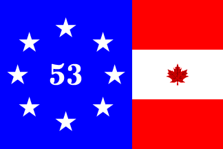 Image by António Martins-Tuválkin, 25 March 2018
[This] ...flag seems to include both Canadian and U.S. emblematic items, and hopefully its exact [file name] attribution will be determined when it comes up for definitive editing.
António Martins-Tuválkin, 25 March 2018
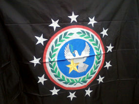 Image from Dave Martucci, 22 February 2018
Received this UFE enquiry today from a Ms. Chisholm. The inquiry reads "I found this flag and was wondering what it is? I searched the internet with no luck. As you can see it has never been used."
The flag has a Black field, White dove with green olive branch in its yellow beak, with two-toned yellow star on blue ball, surrounded with wide white border bearing green wreath as in UN Flag, further surrounded by narrow red ring and then 13 white stars.
Dave Martucci, 22 February 2018
Any additional information? Did you obtain this though the web or simply a personal picture by a user? Perhaps any context would help (where did he/she get it from, what year it is, what country does it belong to, etc.)
Esteban Rivera, 23 February 2018
The photo was sent to me by someone who just purchased the flag in a local market here in Maine.
Dave Martucci, 24 February 2018
There's not much to go on. It is very "military" looking, but with a peace dove, I don't think it is actually a military standard. Let us observe the one somewhat specific part: there are thirteen stars in the circle, which suggests it is US American.
Peter Hans van den Muijzenberg, 2 March 2018
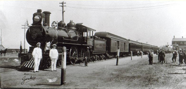
Images from Steve Meredith, 28 February 2018
I have a web site the focuses on the history of the Dominion Atlantic Railway in Nova Scotia, Canada; a railway that it seems royals loved to travel on.
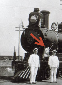
This photo was credited to the Edward VII Royal Train at Windsor NS in 1907 but is widely disputed. The only hint that one has to follow up on is the appearance of the marker flag between the fireman and engineer both of whom are dressed in white. Is this a Disunion Jack 75 years before its time or does it designate a royal title of some description?
On the top tab of the page is also a discussion tab in which we have thrown up some other possible dates, yet interestingly enough, we can find no evidence of an Edward VII Royal tour to Canada that the photo was originally captioned with either.
Might you identify this flag for us or suggest a source who could?
Steve Meredith, 1 March 2018
Although I would appreciate (as neither being a British subject nor a citizen of one of Her Majesty's Realms) some elaboration on the term "Disunion Jack" and some other terms used in the question, so not to leave me guessing, I want to add my two cents: the flag photographed between the two gentlemen is a red ensign of sorts. It is not clear from the photograph which one, though.
I guess the original question was: why is the (supposedly blue) area in the Union Jack part of the flag so light, almost white. AFAIR we had this discussion a couple of times already: b/w photographic material of earlier eras was astonishingly more sensitive to blue light than to red light, so the blue would be much darker in the negative and much lighter in the positive than what we would expect from our experience with more modern b/w film. This results in a lot of strange-looking Union Jacks.
Manuela Schmöger, 1 March 2018
The flag between the two men looks like a defaced red ensign of some sort. Given the fact that we are looking at an old black and white photo, I don't think there is anything to suggest that the blue in the canton is unusually light.
Jonathan Dixon, 1 March 2018
The flag appears to be a Canadian Red Ensign. It may indicate either the Governor General's train or perhaps either the Prime Minister or Lieutenant Governor of Nova Scotia's train. It cannot be Edward VII's train. He came to Nova Scotia when he was Prince of Wales in the 1860s, but never visited Canada during his reign (1901-1910). His son and daughter-in-law, later King George V and Queen Mary visited Canada when they were Duke and Duchess of Cornwall c1901-02, but no reigning monarch visited Canada prior to George VI and Queen Elizabeth's visit in 1939. Also a Royal train would fly the Royal Standard not the national flag.
Michael Halleran, 1 March 2018
The "Disunion Jack" was first presented to the FOTW in message #176022. About its use in real life, see message #176032. The canton of this flag might actually be something like the flag of Port Line Ltd Shipping Company, but derived independently - I have seen illustrations depicting such flags for years, the cartoons by James Gillray being the best known example, but there were a few of unrelated ones, too.
Tomislav Todorovic, 2 March 2018
I can't resist sharing this. I believe this is our most recent trip down the Rabbit Hole (or Black Hole in this case).
Pete Loeser, 2 March 2018
When I thought about this afterwards, it occurred to me that I ought to have wondered about this. Being before its time makes it a rather out of context with mention of the "Disunion Jack". The term "Disunion Jack", as used recently, is a design where the Union Jack is modified by recolouring the blue from the Scottish Saint Andrew's Cross to white. As that Saint Andrew's Cross itself is white, as well, this gives the impression that the Scottish flag has been removed from the Union Jack, with the background of the other two crosses filling up the empty space. Indeed, this is a reference to Scotland possibly leaving the United Kingdom at some point, which would conflict with the Scottish flag being an integral part of the Union Flag, hence, the "Disunion Jack". Note that the usual depiction really stresses the removal of Scotland, and thus doesn't move the Saint Patrick's Cross; its arms stay shifted to one side, as if to allow space for the Cross of Saint Andrew, looking rather like the sails of a mill. I did see a mention of a "Disunion Jock", where the Cross of Saint Patrick was indeed moved to no longer be off-set. As the saltire connected with the red cross of Saint George, the result was a red octocross on white.
Speculating about the flag is a bit iffy, as the context isn't too well defined. Almost everything supposedly known about it is somewhat uncertain. The only direction we can go is compare the scene with itself: is the one flag is different from the others, or do they all appear basically the same. Do they differ from the Union Jack on a gliding scale, and is it caused by lighting or similar phenomena?
Peter Hans van den Muijzenberg, 2 March 2018
Hosted by: Fanshop-Online.de und Handy-Shop.de
Tipp: Apple iPhone 15 im Shop