 image by Martin Grieve, 22 July 2005
FOTW beschäftigt sich mit der Wissenschaft der Vexillologie (Flaggenkunde).
Alle auf dieser Website dargebotenen Abbildungen dienen ausschließlich der Informationsvermittlung im Sinne der Flaggenkunde.
Wir distanziert uns ausdrücklich von allen hierauf dargestellten Symbolen verfassungsfeindlicher Organisationen.
Last modified: 2017-11-11 by bruce berry
Keywords: ekhuruleni |
Links: FOTW homepage |
search |
disclaimer and copyright |
write us |
mirrors
 image by Martin Grieve, 22 July 2005
The Ekurhuleni Metropolitan Municipality is located on the east of the
Witwatersrand conurbation (known colloquially as the East Rand) and comprises
the former municipal areas of Alberton, Benoni,
Boksburg, Brakpan, Daveyton,
Edenvale, Germiston,
Modderfontein, Nigel and parts of Kempton Park and Tembisa.
This metropolitan municipality was created following the re-organisation of
South African local government in December 2000. Consequently the flags of the
municipalities which make up Ekurhuleni are longer flown. The new municipal
symbols for Ekurhuleni were adopted in February 2002.
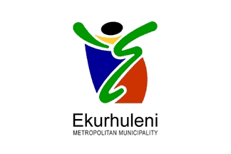
The new Ekurhuleni Metropolitan Council flag has the metropolitan logo in the
centre of a white field making it a modern armigerous-type flag. The logo takes
the form of a stylised human figure and is in the South African national colours.
The ellipse that forms the head of the figure is black, which is said to
represent the importance of coal to the area, while the yellow irregular
triangle between the head and the body of the figure represents the gold mining
industry. The large irregular blue shape depicts the importance of aviation and
water sectors which an important part of the local economy. The central green
element represents the environment and agriculture while the red serves both to
balance the logo and link it to the national flag.
Bruce Berry, 30 Aug 2006
 image by Martin Grieve, 22 July 2005
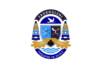
In addition to the metropolitan logo, a new municipal coat of arms has also been
adopted. These arms appear in the centre of the mayoral flag. The guiding theme
of the arms relates to the name Ekurhuleni - meaning a place of peace. A blue
firmament holds a graphic symbol of peace. The white dove is a symbol of the
spirit of peace and the olive branch symbolises the growth of that peace.
At the bottom of the shield is the depiction of the historical strength of the
region, gold and related minerals while in top left is the symbol for nuclear
fusion which represents scientific development and progress - the social and
economic ambitions of the area.
The top right of the shield features a combination of a traditional and modern
musical instrument - a kudu horn and trumpet - that symbolises the link to the
spiritual realm through the practice of the Arts. These three aspects in the
shield form a holistic depiction of human needs: to grow, to work and to learn.
Flanking the crest are supporters in the form of two Pedi women clad in
traditional dress. These represent the nurturing and guidance within the human
family. The oak leaves at the base represent the promise of growth and between
the leaves is the symbol for water - the key resource of life. The motto,
Prosper in Peace, expresses the essential mission and hope of the Ekurhuleni
region.
gt-ek.jpg) scan by
Bruce Berry, 30 Aug 2006
scan by
Bruce Berry, 30 Aug 2006
Neither the metro flag, the new municipal arms nor the mayoral flag have been registered with the
South African Bureau of Heraldry.
Bruce Berry, 30 Aug 2006
Hosted by: Fanshop-Online.de und Handy-Shop.de
Tipp: Apple iPhone 8